The exponential increase of global interactions among people, caused by globalisation, lead to a dramatic change in our daily life, transforming our social, political and economic structure. Our travelling habits are no exception in the radical changes we underwent in past few decades, the rapidity and facility with which we can reach nearly every part of the world has encouraged people to travel more, further and differently than in the past. Being able to identify the predominant human fluxes and new travelling habits of citizens could be highly beneficial in a plethora of sectors and domains. For instance, never as today we can understand the importance of modelling the spreading of a virus across the world, only achievable with a solid knowledge of the peoples’ movements within and among countries. With these pieces of information governments could put in place ad hoc containment measures potentially more effective, as based on the true behaviour of human beings. In a business context, deeper knowledge of human mobility could be insightful to investigate the most and least popular travelling routes, in order to efficiently allocate resources and establish prices for example. For social studies, the study of the incoming and outgoing fluxes could reveal precious information on a population’s culture and habits.
There are clearly multiple approaches to investigate human mobility across the world, the one we are going to follow is based on the data gathered by two social networks, namely Gowalla and Brightkite, for which we have available a set of users and respective check-ins locations. By relating the latitude and longitude coordinates of check-ins to the respective countries where the localization took place we can investigate the users’ movement, potentially in the home country and abroad.
The main questions we asked ourselves
- What are the main fluxes of people over the world ?
- Have some countries different travelling habits than others ?
- What is the influence of factors like the language, the distance or the GDP on travelling habits ?
Where did we start?
Given our location-based social networks Gowalla and Brightkite we had available millions check-ins and the the respective friendship network.
Here’s a summary of the data :
| Social network | Number of check-ins | Number of users | Number of countries and places | Number of nodes | Number of edges | Date of collection |
|---|---|---|---|---|---|---|
| Brightkite | 4 491 035 | 50 686 | 242 | 58 228 | 214 078 | April 2008 - October 2010 |
| Gowalla | 6 442 728 | 107 069 | 196 | 196 591 | 950 327 | February 2009 - October 2010 |
How did we shape the data ?
1. Finding user’s home
At the beginng, the only thing we had was a very large amount of check-ins. Before everything else, we had to define a house for each user, in order to know its nationality and the distances that the users travel once leaving home.
To achieve this, we discretized the world into 25 km x 25 km cells. The home location of a user was the average location of his/her check-ins within the cell in which we we had the highest amount of check-ins. Based on the assumption that most check-ins are done at home.
You can see here the distribution of users’ home locations (normalised by the country population) over the world :
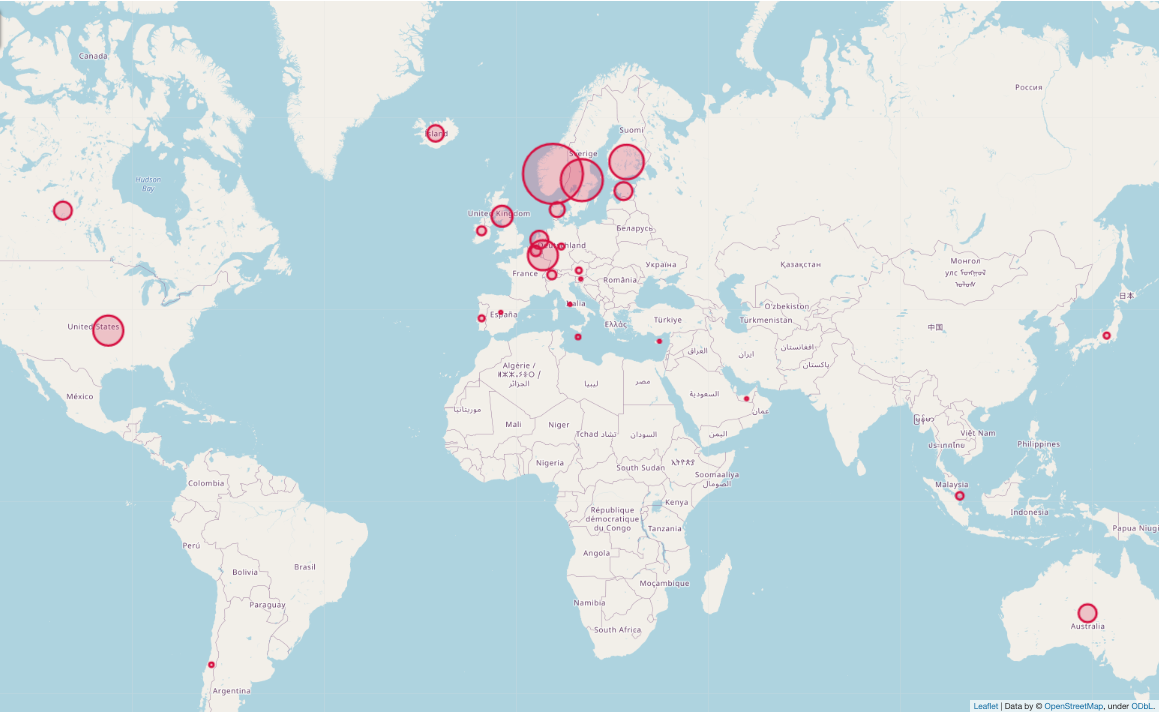
Once this step was completed, we had already a clearer portray of each user, knowing at least the origin country for each of them.
2. Geographical boundaries of our study
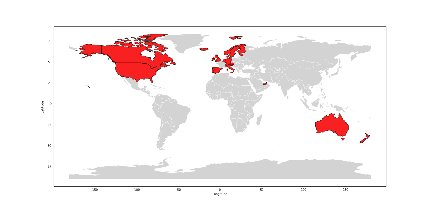
As expected the distribution of check-ins and home locations was not homogeneous on Earth. In particular, these two social networks are more popular in the US and some European countries than in Asia or Africa. To draw meaningful conclusions from the results we had to restrict our analysis to a smaller and more represented set of users. For this reason,we only selected regions of the world where enough data were available. Specifically, for both social networks we only kept countries in which at least 1 person out of 100 000 was a user.
The selected countries are represented on this map, except for Malta and Singapore that are not defined in Geopandas :
Results
1. Comparison between United-States and Europe
For each check-in, we could compute the distance between the user's location while checking-in, and his/her home location. Thanks to some useful statistics we could identify some insightful information on the data. Given the geographical boundaries of our study, we have chosen to compare the US and the average results of European countries that are part of the study (simply referred as Europe in what follows).
Moreover, as we are only interested in travelling habits, the following statistics are based on check-ins that were done at a distance from home greater than 200 km, which is how we define a travel.
Please note that in order not to account twice some users that could use both Brightkite and Gowalla, we will always present you the results for both of them separately and analyse the similarities and differences between these two.
The following figure shows how far from their home are people travelling when they leave their country.
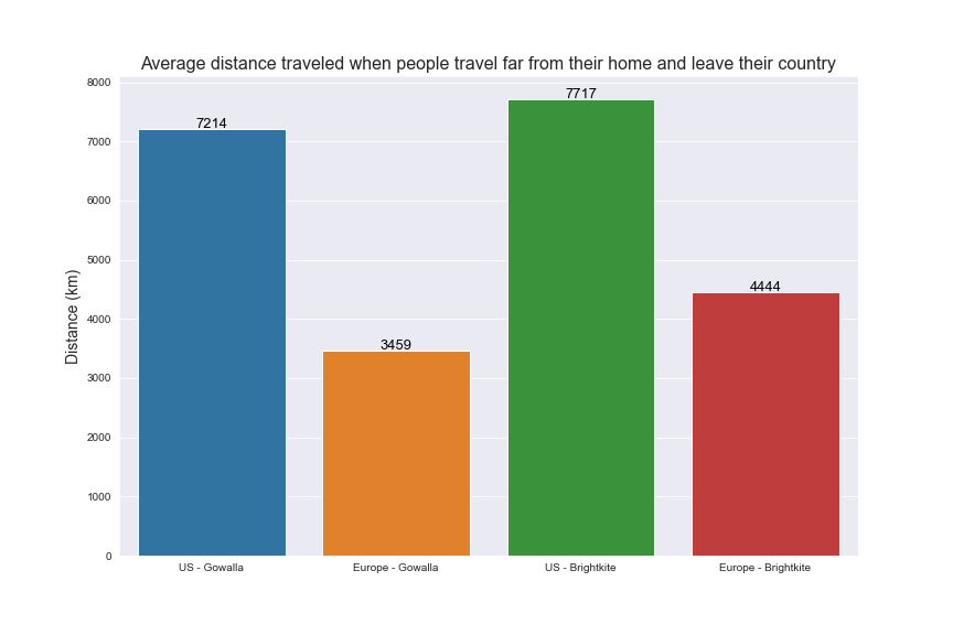
You can see that American people go much further than European when they leave the US. This becomes rather intuitive if we think that the US is almost as big as all Europe in terms of surface.
The next figure shows the how far people go on average, when they travel (i.e. 200 km or more from their house), independently of the fact that they leave their country or not.
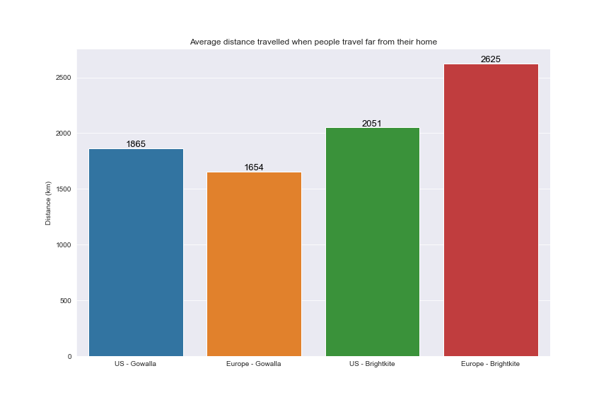
One can observe that Gowalla's Americans users travel further than Gowalla's European users and Brightkite's European users travel further than Brightkite's American users. Therefore, we can unefortunately not conclude much due to this lack of data in Europe. Indeed, the big gap between Gowalla's and Brightkite's users in Europe is quite surprising and shows that more data is needed in Europe to draw strong conlusions about this aspect of the study.
The next figure shows the percentage of people who leaves their country when travelling. This corresponds to the percentage of people who, when travelling, left their country over the data collecting period (20 months for Gowalla and 30 months for Brightkite).
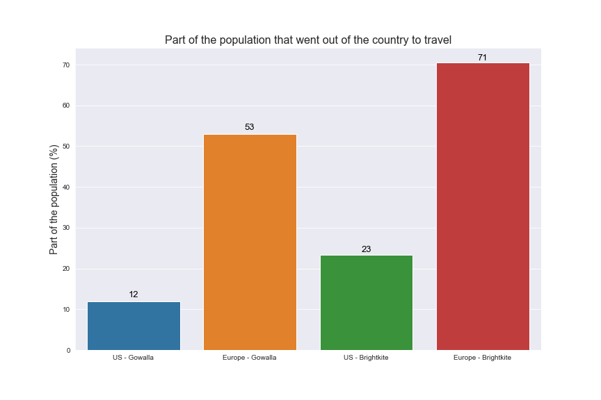
As the collection time was 10 months longer for the Brightkite dataset, it is not surprising to see higher numbers, as people will travel more over this longer period. It is also not surprising to see that American people leave less their country as Europeans, as US is much bigger in terms of surface.
Let’s see if this is changing when considering continents instead of countries.
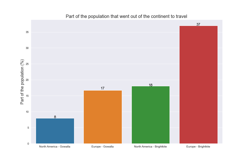
Interesting results ! Here you can see that for both datasets, there are roughly twice as many Europeans that leave Europe to travel than Americans leaving North America. Again, the gap between Gowalla and Brightkite user's can be explained by the difference of collecting periods.
The following figure is about the average number of countries that were visited by travellers over the collecting period.
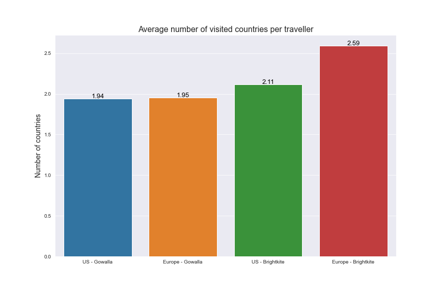
Its seems that on average, European people visit more countries than Americans. Moreover, the ratio between these numbers over the time period shows that people are on average visiting one foreign country per year, which makes sense.
2. What is influencing travellers ?
Within the scope of this work, we studied the influence of three parameters :
- the distance between countries
- the language
- the difference of GDP between countries
To analyze these factors, we performed a polymomial analysis, meaning that we tried to model the number of travels between two countries by polynomial functions of the three previous factors. The numerical results of the polynomial regression are available as an appendix.
Let's see the curves of influence given by the polynomial regression. Please note that on the following graphs, the factors are standardized, meaning that 0 is equivalent to the mean value and 1 to the sum of the mean value and the standard deviation. We were careful to make the graph start at the actual zero in common units (km, $).
The first figures represent the influence of the distance on travelers.
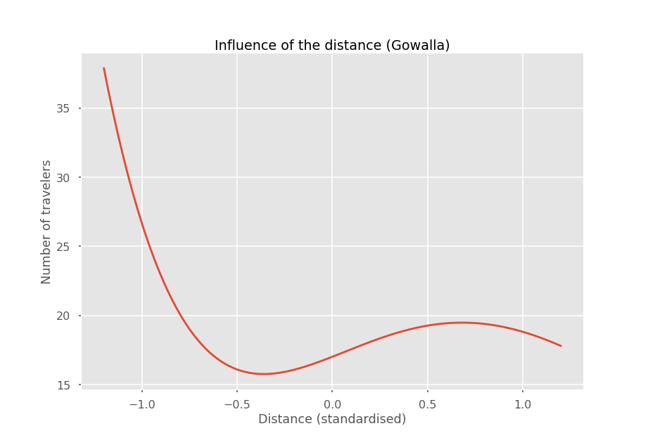
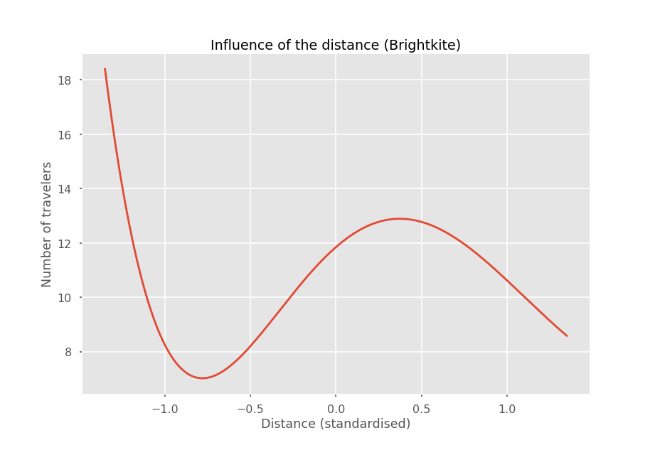
These curves have similar shapes. First, one can observe that the number of travelers decreases with the distance. But reaching a certain distance, the number of travelers stops decreasing. We can interpret this by saying that when people are traveling in a relatively close zone around them, a majority of them stays close to their home locations. But, once the trip is very far away, the distance does not matter so much as it is already very large.
About languages :
-18.65% of travels are done in a same-language country for the Brightkite dataset
-14.21% of travels are done in a same-language country for the Gowalla dataset
This is a lot given the fact that 5.82% of the selected countries have the same language for the Gowalla dataset and 6.75% for the Brightkite dataset.
3. But where are they going ?!
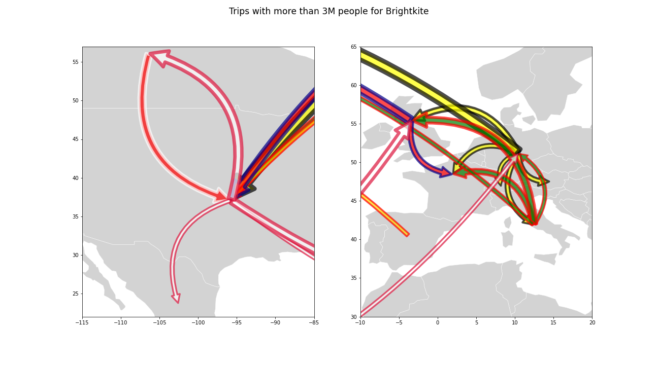
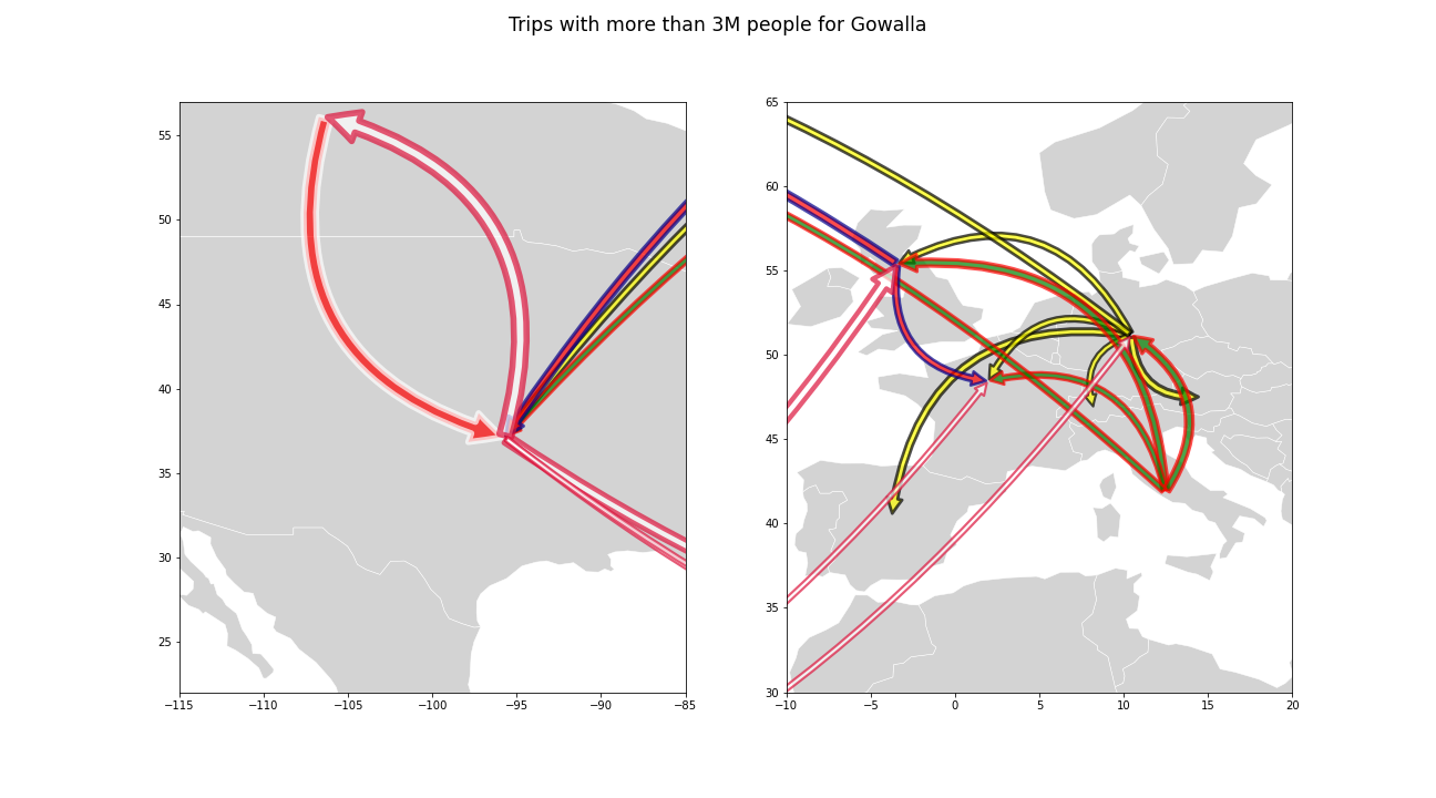
By looking at these graphs, respectively for Brightkite and Gowalla, we can notice few important and common features, for instance a comparable amount of people travel from the US to Canada and viceversa, similarly people from the US tend to travel to the neighbouring country Mexico. It would have been interesting to investigate the particular relation Mexico-US in light of the rather strict immigration policies imposed by the United States, but unfortunately nothing could be inferred for the travels from Mexico, as not enough users were present. In Europe, it is evident that most of the travels happen among the biggest economical partners, namely UK, Germany, Italy and Spain (France is not included as not enough users were present). The following investigation highlighted a more remarkable flux of people among Italy and the UK, Germany and the US and finally the UK and the US. This last connection emphasizes a particularly interesting characteristic also in line with real observations, in fact the connection London-New York is known to be the busiest and most profitable of the world.
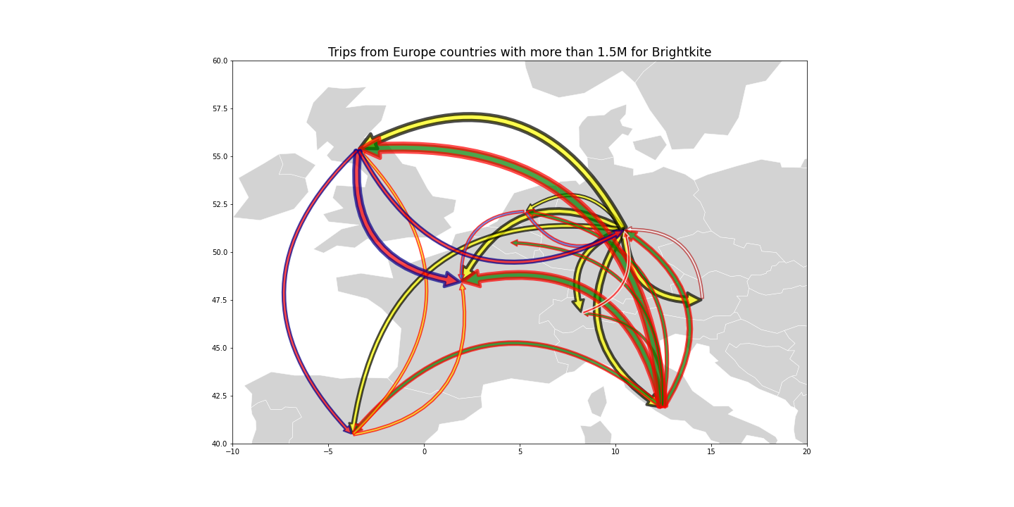
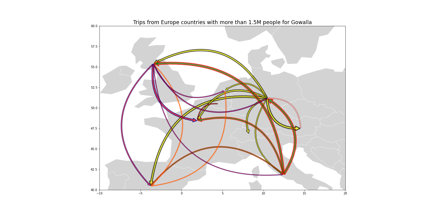
Similar conclusions can be reached by analysing the results for 1.5M users for Brightkite and 1M users for Gowalla, which present similar behaviours. Firsly, it has to be pointed out that the reason why the arrows for Gowalla are thinner than for Brighkite is that we have a 10 months difference in the data acquisition period, thus less check-ins were collected for each user in the Gowalla datset. Another feature, not detectable from the maps above, is that Germany plays a predominant role in Europe, in fact many Germans travel abroad, but not many people enter the country. Not many arrows leave from Spain, perhaps suggesting that Spanish people prefer travelling within the country instead than abroad.
Conclusions
As a result of this analysis we were able to identify some of the major human fluxes across the world based on the data gathered in the Gowalla and Brightkite datasets. Most interestingly we could detect common behaviours between the two independent datasets suggesting that the observations are consistent and we are not only detecting random travels among countries. It has to be pointed out that our results are strictly dependent on the number of users for each country, thus we cannot draw any conclusion on not represented states in the social network.
The team
Our team is composed of 3 students from EPFL :
Chiara ONGARO, Cyril CHAMBE and Matthieu SOUTTRE
Appendix
Datasets used
Country Mapping - ISO, Continent, Region
Language list by country and place
Methods
Polynomial regression
Here are the numerical results of the polynomial regressions :
-
for the Brightkite dataset

-
for the Gowalla dataset

Please note that the distance and GDP difference have been standardised, and that the same_language variable is a binary variable (equals 1 if the departure and arrival countries have the same language and 0 of not).
Thanks a lot for reading our data story ! :-)